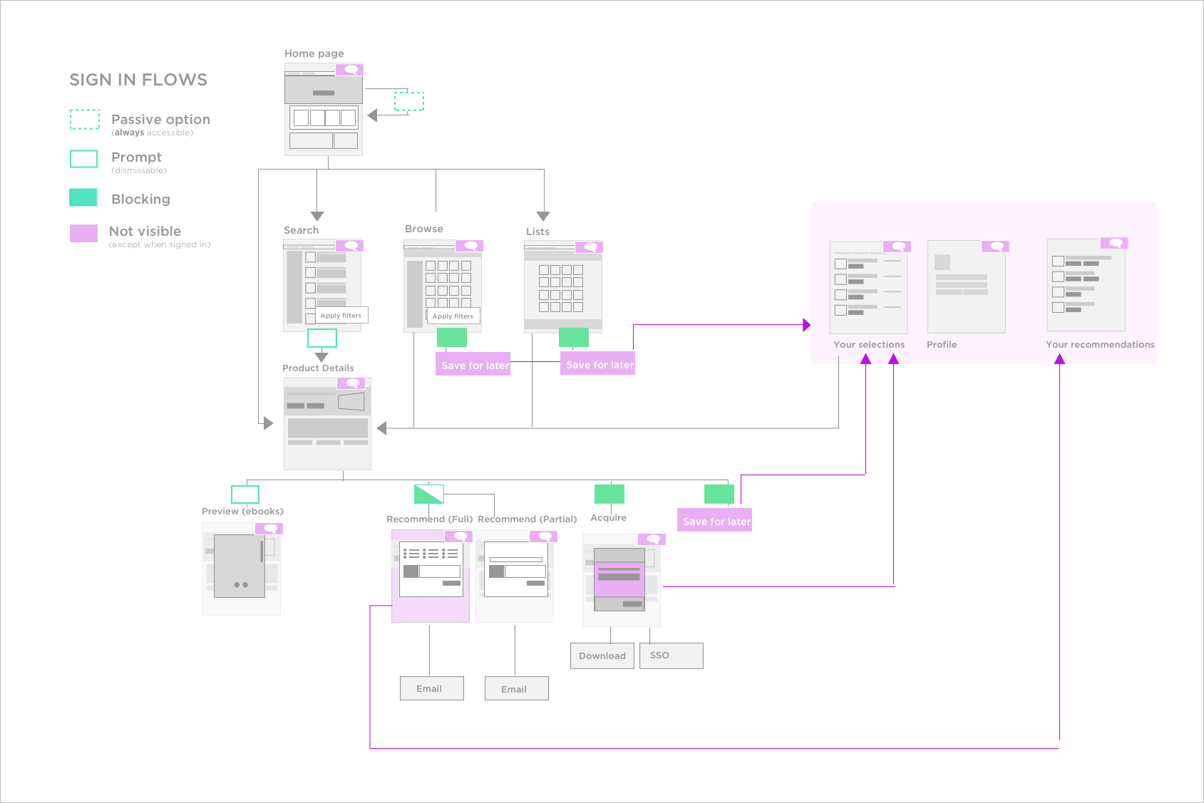
Show and Tell what we're all about
Opening our marketplace to users without enterprise context meant that we needed to provide some sort of explanation or indication of what the BloomBoard marketplace had to offer. In order to maintain a consistent experience for existing users, and in an effort to mimic more consumer-oriented products, my team opted to skip a traditional landing page in favor of allowing users to experience the product without creating an account. I identified UI and functionality changes required throughout the site in order to place searching and browsing in front of the sign-in wall, and designated user actions that would prompt the account creation flow. We kept sharing, purchasing, and saving behind the sign-in wall in order to encourage account creation.
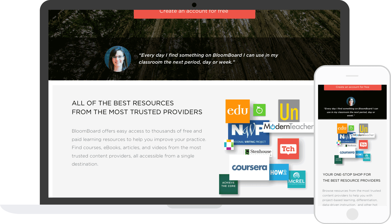
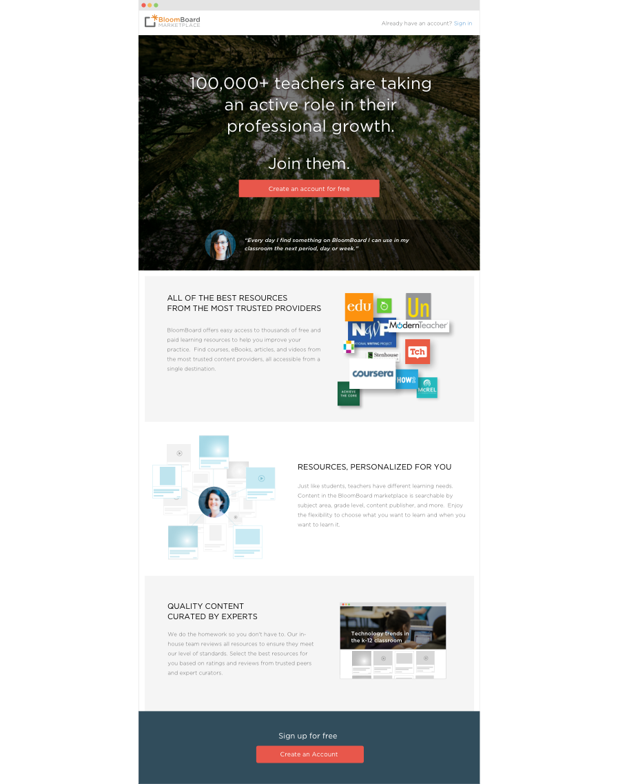
Because we were constrained by the change-resistant nature of our existing users, we knew we could not replace our homepage with a more descriptive landing page that would orient those unfamiliar to the product. Instead, I decided to follow the common pattern of linking to an “about page” that describes the value of the product in detail.
Account creation, payments, and social sharing
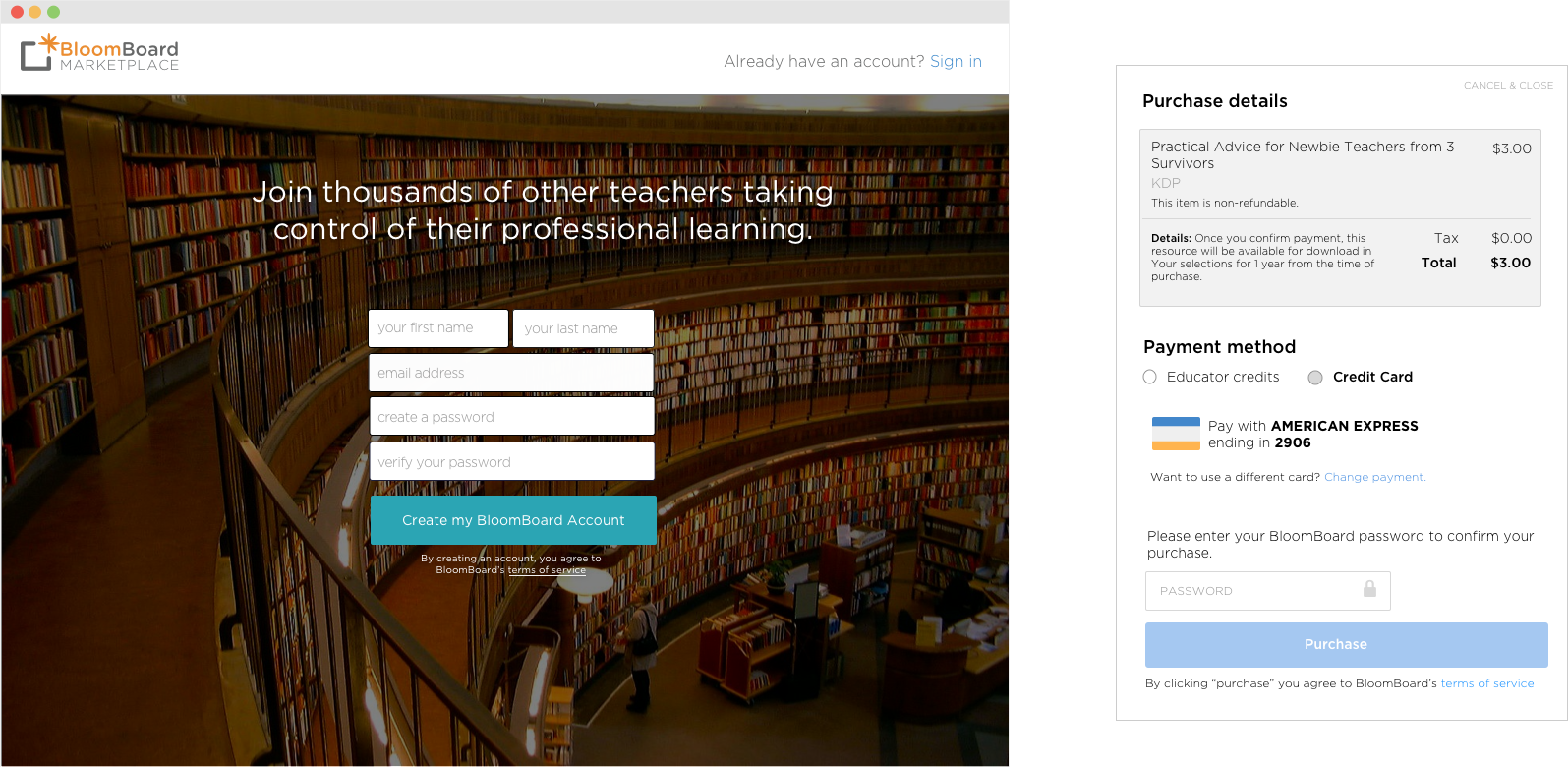
Because BloomBoard account managers created all enterprise accounts, we didn’t have a UI for individual users to create their own accounts. Additionally, enterprise users paid for resources by requesting credits from their district, so our site did not offer a way for non-enterprise users to purchase. I created both interaction and visual designs for these flows and redid the sign-in experience for all users. Lastly, sharing in the old marketplace was limited to in-product sharing and was designed to encourage top-down, administrator-to-teacher recommendations. In an effort to promote more viral growth, we redesigned the sharing experience to include social sharing and sharing with anyone — with or without a BloomBoard account — via email.
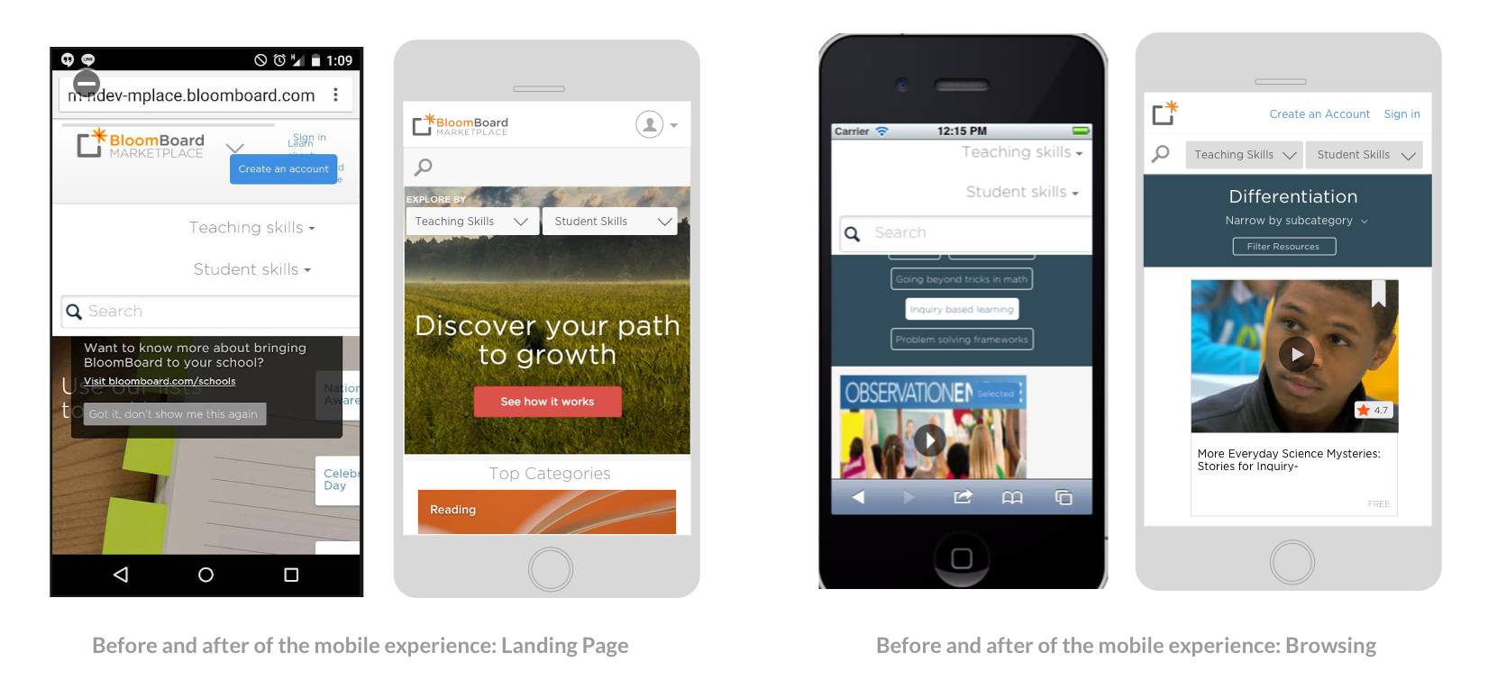
Making it mobile friendly
Before we opened up the marketplace to consumers, the site had been accessed primarily during official sessions on school laptops, so we were left with many legacy designs that weren't mobile friendly. We needed to tweak, and in some cases entirely redo, all pages in the site to optimize for mobile devices. I prioritized the landing page, as we anticipated unregistered users receiving and clicking through from share emails on their phones.